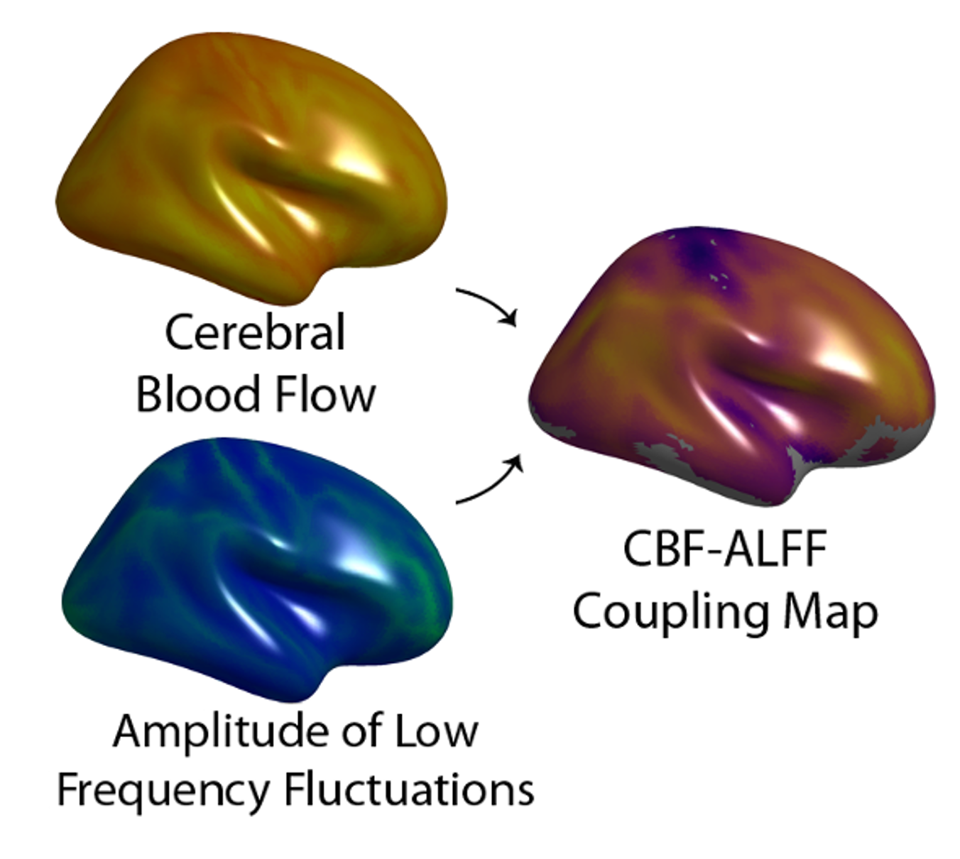
Developmental Coupling of Cerebral Blood Flow and fMRI Fluctuations in Youth
Project Lead
Erica B. Baller
Faculty Leads
Theodore D. Satterthwaite and Russell T. Shinohara
Brief Project Description:
831 participants from PNC were included. CBF (from ASL) and ALFF (from rs-fMRI) images were projected to the 2D surface space (fsaverage5), and vertexwise coupling occured via locally-weighted regressions. Group level regressions relating coupling to age, sex, and executive functioning accuracy were performed.
Analytic Replicator:
Azeez Adebimpe
Collaborators:
Erica B. Baller, M.D., M.S., Alessandra M. Valcarcel, Ph.D., Azeez Adebimpe, Ph.D., Aaron Alexander-Bloch, M.D., Ph.D., Zaixu Cui, Ph.D., Ruben C. Gur, Ph.D., Raquel E. Gur, M.D., Ph.D., Bart L. Larsen, Ph.D., Kristin A. Linn, Ph.D., Carly M. O’Donnell, B.A., Adam R. Pines, B.A., Armin Raznahan, Ph.D., David. R. Roalf, Ph.D., Valerie J. Sydnor, B.A., Tinashe M. Tapera, M.S., M. Dylan Tisdall, Ph.D., Simon Vandekar, Ph.D., Cedric H. Xia, M.D., Ph.D., John A. Detre, M.D., Russell T. Shinohara, Ph.D.^, Theodore D. Satterthwaite, M.D., M.A.^
^shared last author
Project Start Date:
My version - 10/2020
Current Project Status:
Completed
Dataset:
PNC
Github repo:
https://github.com/PennLINC/IntermodalCoupling
Path to data on filesystem:
PMACS:/project/imco/ most work done in /project/imco/baller
Slack Channel:
#imco and #coupling
Zotero library:
IMCO
Current work products:
SOBP Poster 4/29/2021 - https://doi.org/10.1016/j.biopsych.2021.02.445
OHBM Poster 6/22/2021 - “Mapping the Coupling of Cerebral Blood Flow-Amplitude of Low Frequency Oscillations in Youth.”
ACNP Poster 12/10/2021 - “Developmental coupling of cerebral blood flow and fMRI fluctuations in youth.”
Path to Data on Filesystem PMACS
All data was drawn from the chead n1601 datafreeze. A copy of it can be found at /project/deid_bblrepo1/n1601_dataFreeze/
/project/imco/homedir/couplingSurfaceMaps/alffCbf/{lh,rh}/stat/ : directories with individual coupling maps (these were generated on chead)
/project/imco//baller/subjectLists/n831_alff_cbf_finalSample_imageOrder.csv : sample and demographics
/project/imco//pnc/clinical/n1601_goassess_itemwise_bifactor_scores_20161219.csv : psychiatric data
/project/imco/pnc/cnb/n1601_cnb_factor_scores_tymoore_20151006.csv : cognitive data
CODE DOCUMENTATION
The analytic workflow implemented in this project is described in detail in the following sections. Analysis steps are described in the order they were implemented; the script(s) used for each step are identified and links to the code on github are provided.
Sample Construction
We first constructed our sample from the PNC 1,601 imaging dataset. Each participant underwent cognitive testing, clinical phenotyping, and neuroimaging.
The following code takes the PNC 1601 sample, and goes through a variety of exclusions to get the final n. Specifically, it removes subjects with poor QA data, medical comorbidity, abnormal brain structure, or on psychoactive medications.
CBF-ALFF Map generation
After we obtained our sample, we constructed single subject CBF-ALFF coupling maps.
Volume to surface projection
First, brain volumes were projected to the cortical surface using tools from freesurfer. This was performed on chead, an old cluster that has now been retired. Input for this analysis consists of a csv containing bblid, datexscanid, path to the subject-space CBF or ALFF image to be projected, and path to the subject-specific seq2struct coreg .mat file (as well as the associated reference and target images). It further requires that FreeSurfer have been run on the subjects. Files were drawn from the chead 1601 data freeze. Datafreeze information is now also available on pmacs (see above links for pmacs).
- input csv:
subjList.csv - reference volume (example):
99862_*x3972_referenceVolume.nii.gz - target volume (example):
99862_*x3972_targetVolume.nii.gz
The following code converts the transform matrix (lta_convert), projects the volume to the surface (mri_vol2surf), and resamples the surface to fsaverage5 space (mri_surf2surf).
Then we transfor the matrix from BBL orientation to freesurfer orientation using the code below.
transformMatrix.R](https://github.com/PennLINC/IntermodalCoupling/blob/gh-pages2/CR_revision/surface_projection_and_coupling/transformMatrix.R)
Generating 2D coupling maps
Generating 2D Coupling Maps Wiki
Input for this analysis consists of a csv that lists bblid/scanid.
It also requires that the subjects have been processed using freesurfer. Specifically, these files must be present:
lh.sphere.reg lh.sulc lh.thickness rh.sphere.reg rh.sulc rh.thickness The fsaverage5 directory must be present as well.
We use the following command line R program that estimates coupling for a given list of subjects. Flag options for the coupling job are listed at the top of this script. It calls kth_neighbors_v3.R.
The following code is run by coupling_v2.R and estimates the first k sets of nearest neighbors for each vertex for a particular template.
- This code requires FS version 5.3 (it will not run on the updated version 6.0).
Coupling Regressions
We next wanted to examine whether CBF-ALFF coupling changed across development, differed by sex, and related to executive functioning.
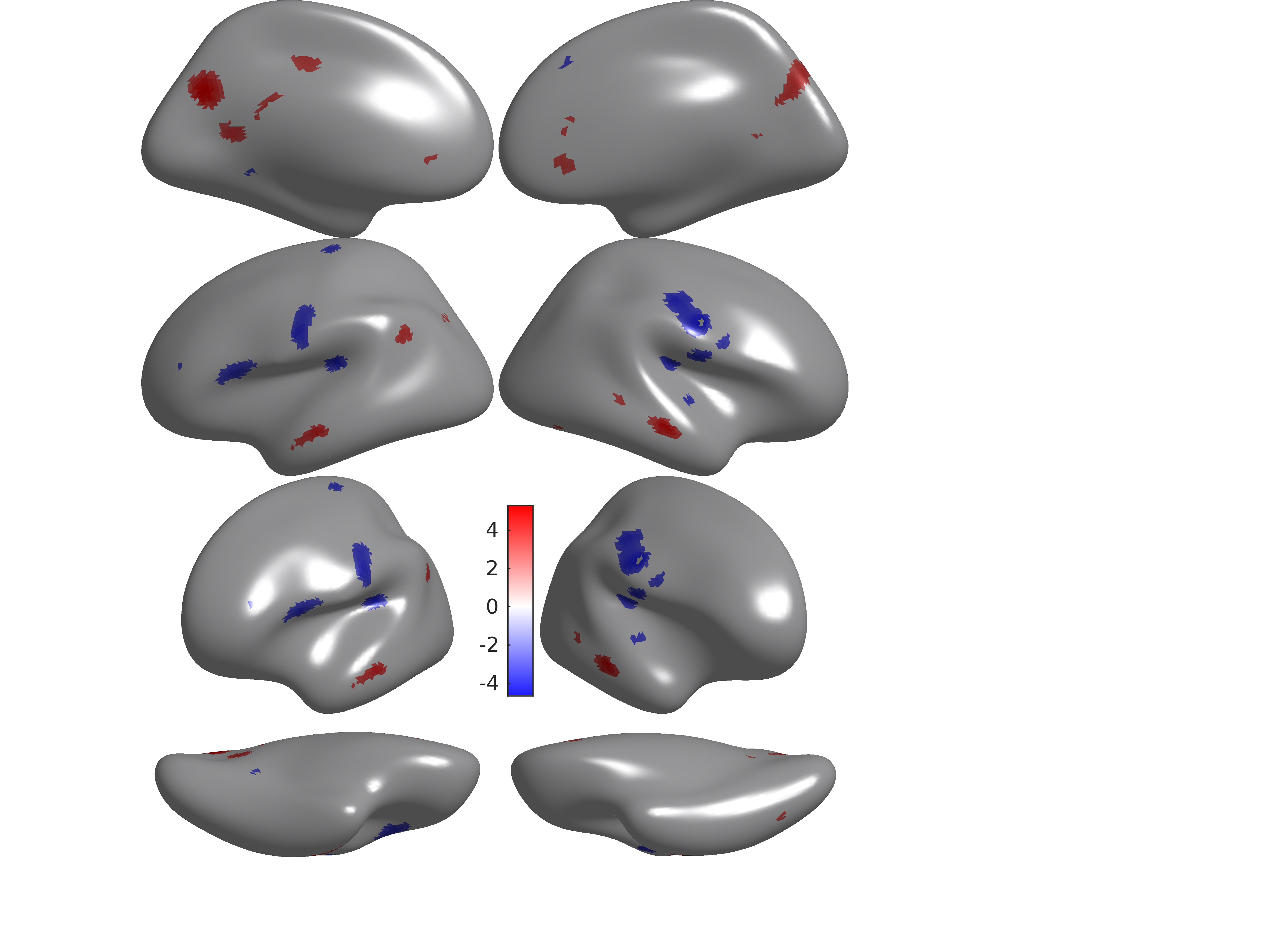
The following code goes vertex by vertex and does coupling regressions, specifically relating CBF-ALFF coupling to age, sex, and cognition. It does vertex-level FDR correction, thresholds at SNR>=50 and stores both corrected and uncorrected Ts, ps, and effect sizes into vectors and saves them to the output. These files can then be used for visualization in matlab.
coupling_accuracy_fx_T_with_effect_sizes.R
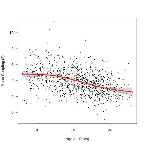
In addition to doing vertex-level analysis, we also explored how mean coupling (i.e. 1 value per participant) related to age using the code below. We used the FDR-corrected output from the coupling_accuracy_fx_T_with_effect_sizes.R age analysis as inputs. We also calculated the derivative of the spline to assess where the couplingxage effects were most rapidly changing.
Mean coupling by age
Visualizations on inflated brain
We did our brain surface visualizations in matlab. The following is a sample matlab visualization script. It is called with three parameters, and produces an inflated brain. Variations of this script were used to change colors in the Figures.
PBP_vertWiseEffect_Erica_Ts_pos_and_neg_results_outpath.m
- For example, a call would be: PBP_vertWiseEffect_Erica_Ts_pos_and_neg_results_outpath(‘/project/imco/baller/results/CR_revision/couplingxsnr_maps/eaxmask_50_lh.csv’,’/project/imco/baller/results/CR_revision/couplingxsnr_maps/eaxmask_50_rh.csv’,’eaxmask_thresh50_values’)
Sample output: Coupling Executive Accuracy
Spin Testing and Visualization
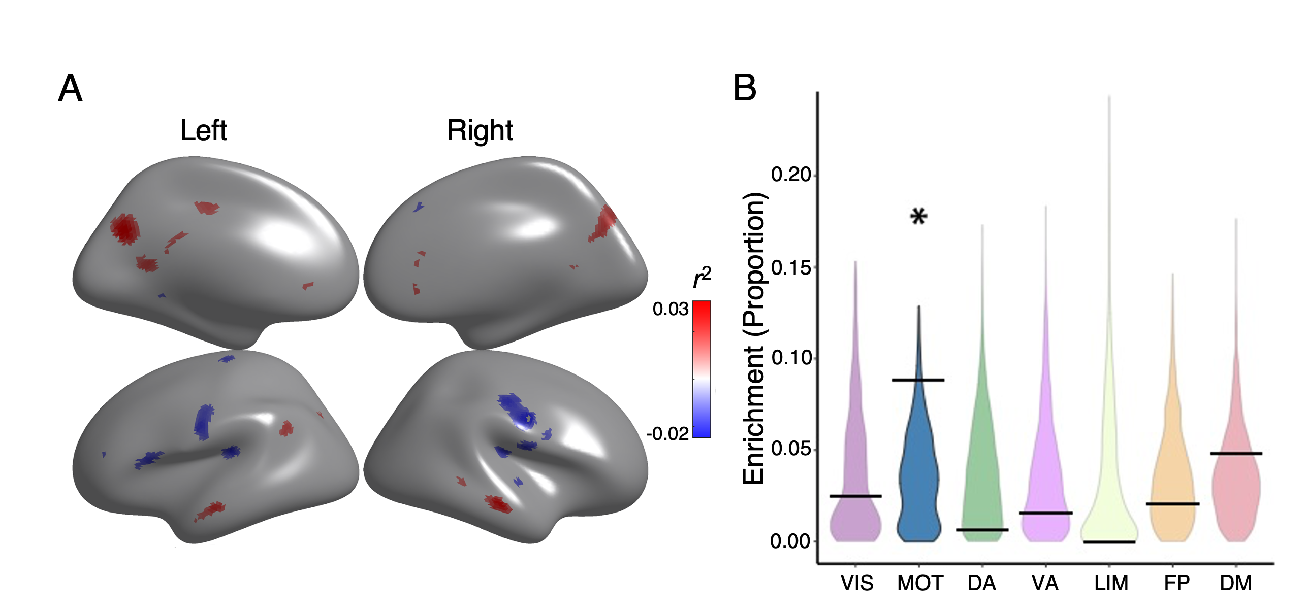
In reviewing our results, we became interested in whether our findings mapped onto Yeo 7 networks. For interpretability and for graphs, we decided to do a variation on the spin test. Overall, the goal was to take the vertices (10242 for each hemisphere), and spin. We would next ask how many vertices would randomly and by chance fall within certain Yeo networks as compared to what we actually saw. A challenge of this spin is that when we spin the vertices, we include medial wall which is guaranteed to be 0. In order to account for this, we calculated the proportion of vertices within each network minus the ones in the medial wall.
The below code makes trinarized yeo masks, 1, 0, -1. In order to run permutation analyses on the Yeo networks, I need to trinarize my fdr corrected maps. If a vertex is corrected, it will get a 1. If not, 0. If it is within the medial wall, it will get a -1. This will allow me to later assess how many vertices within each network met correction (1s), did not meet statistical significance (0s), and should be excluded from the proportion calculation (-1). For the mean CBF-ALFF map, as no statistic was calculated, we retain the T values and spin them directly.
make_trinarized_maps_for_spin_test_snr.R
The matlab code below makes the spins. We provided 5 parameters 1. left hemisphere vector with trinarized data 2. Right hemisphere vector with trinarized data 3. Number of permutations per hemisphere (we use 1000/hemisphere) 4. output directory 5. output filename
The following script calculates the proportion of FDR-corrected vertices within each Yeo 7 network for both the real data as well as the 2000 permuted spins. The proportion was calculated by taking the (# of vertices with a 1) divided(/) by the (number of total vertices within network minus number of negative vertices). For the mean coupling results, we evaluated the spun T values with the actual T values per network.
spin_proportion_calculations_and_plots_snr.R
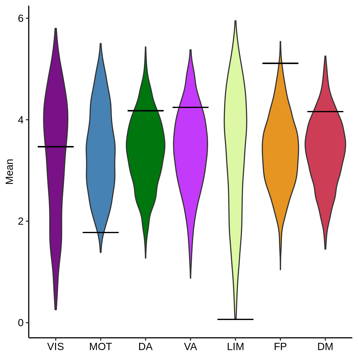
Lastly, we use the following code to visualize the spin results. It uses ggplot2 to make violin plots for display, calling functions from imco_functions.R. The violin represents the distribution of proportions from the permutation analysis. The black bar represents the real data.
Sample output: Mean Coupling Spin
Helper Functions
All helper functions can be found in imco_functions.R
Final Figures
Figure 1 - Schematic
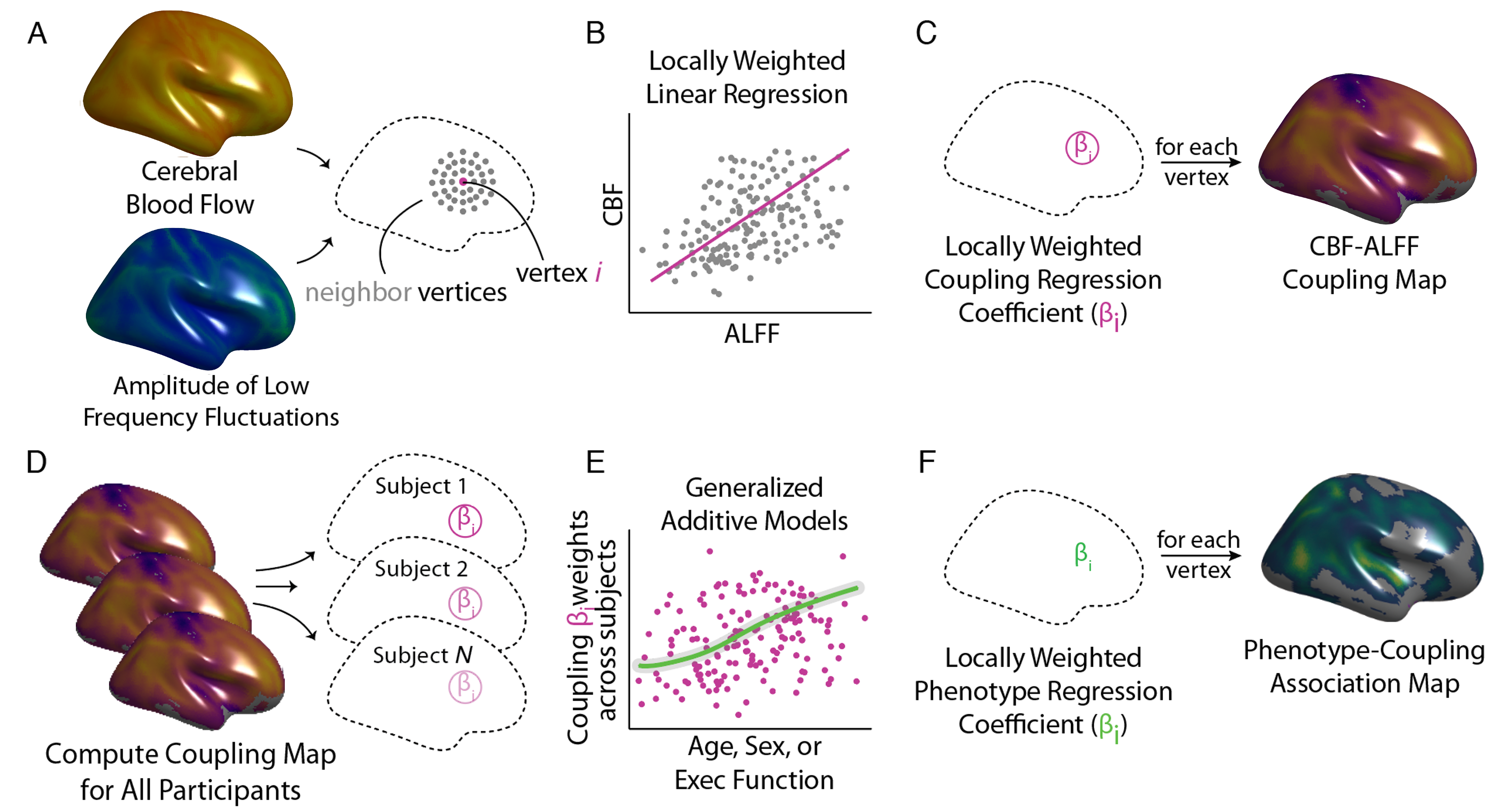
Figure 2 - Mean coupling enriched in frontoparietal network
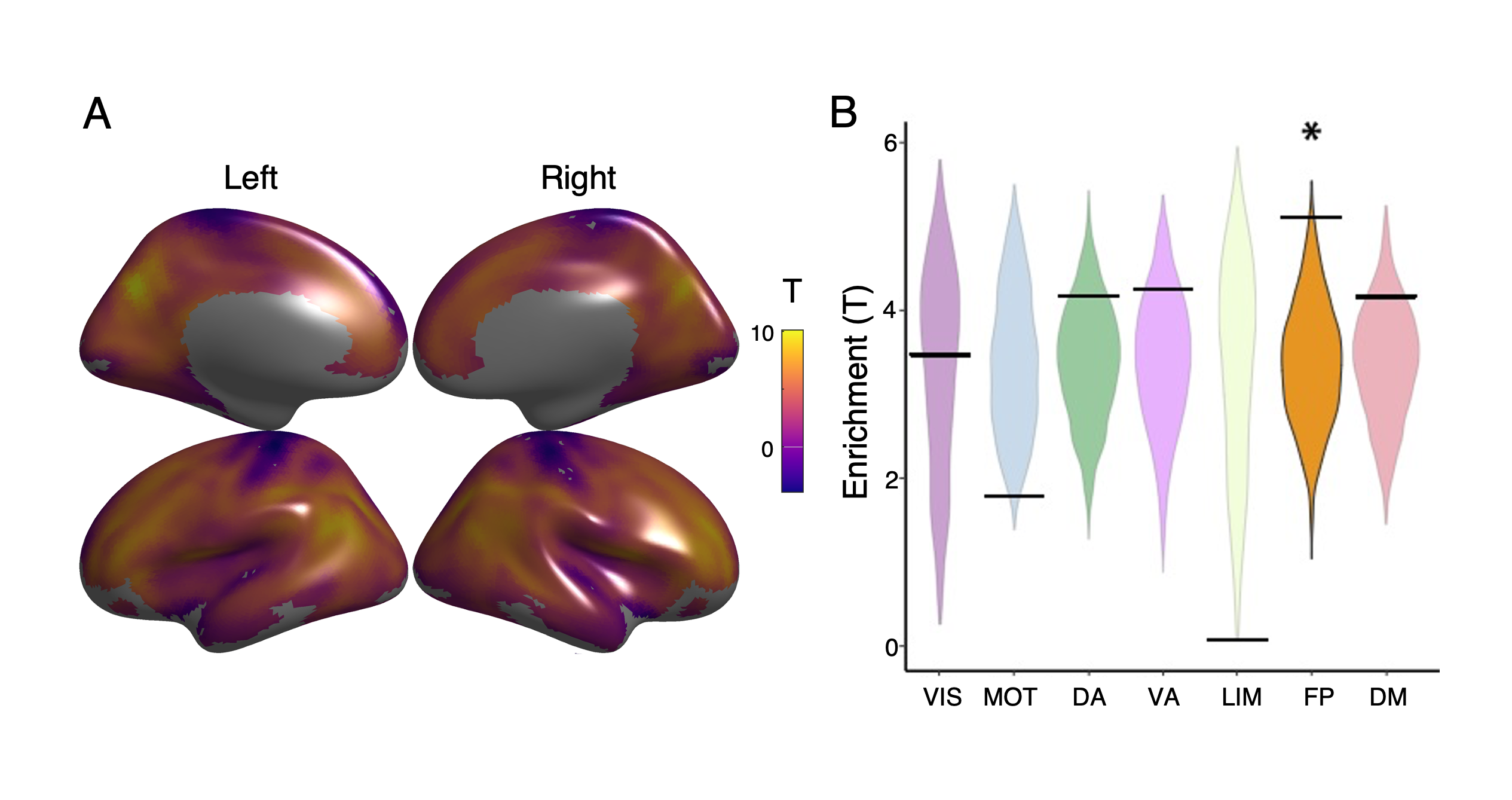
Figure 3 - Age effects enriched in dorsal attention network
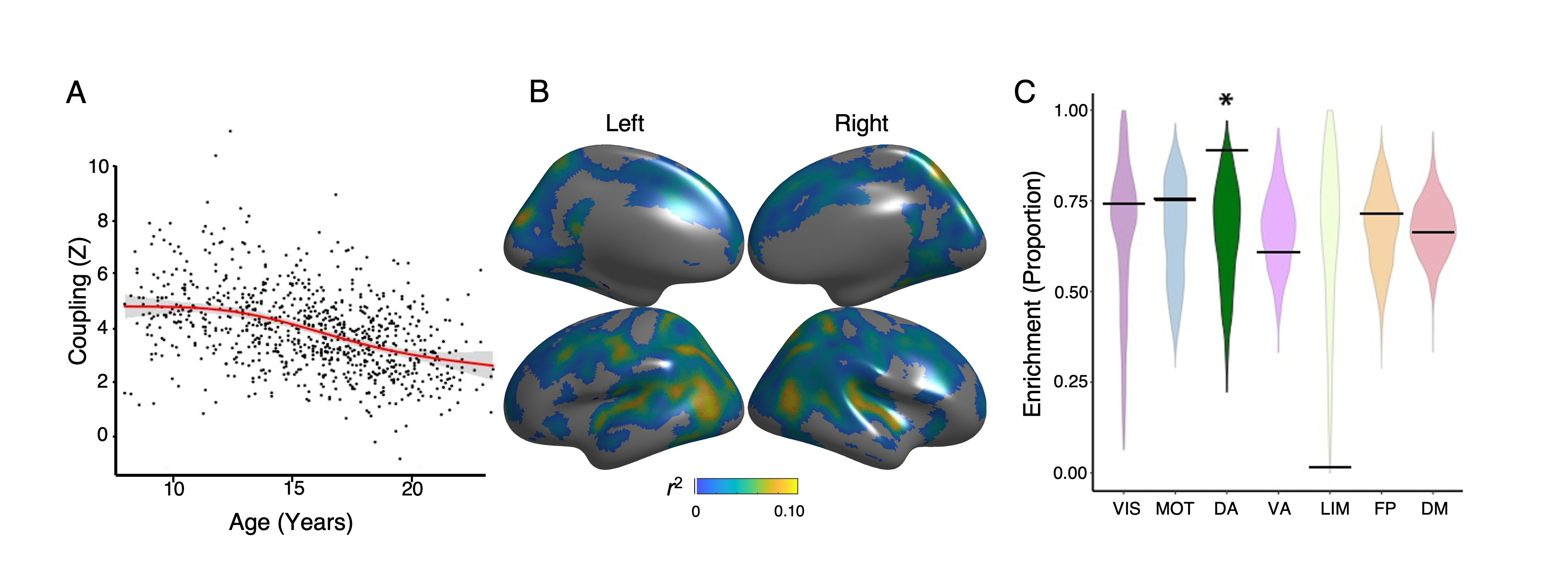
Figure 4 - Sex effects enriched in frontoparietal network
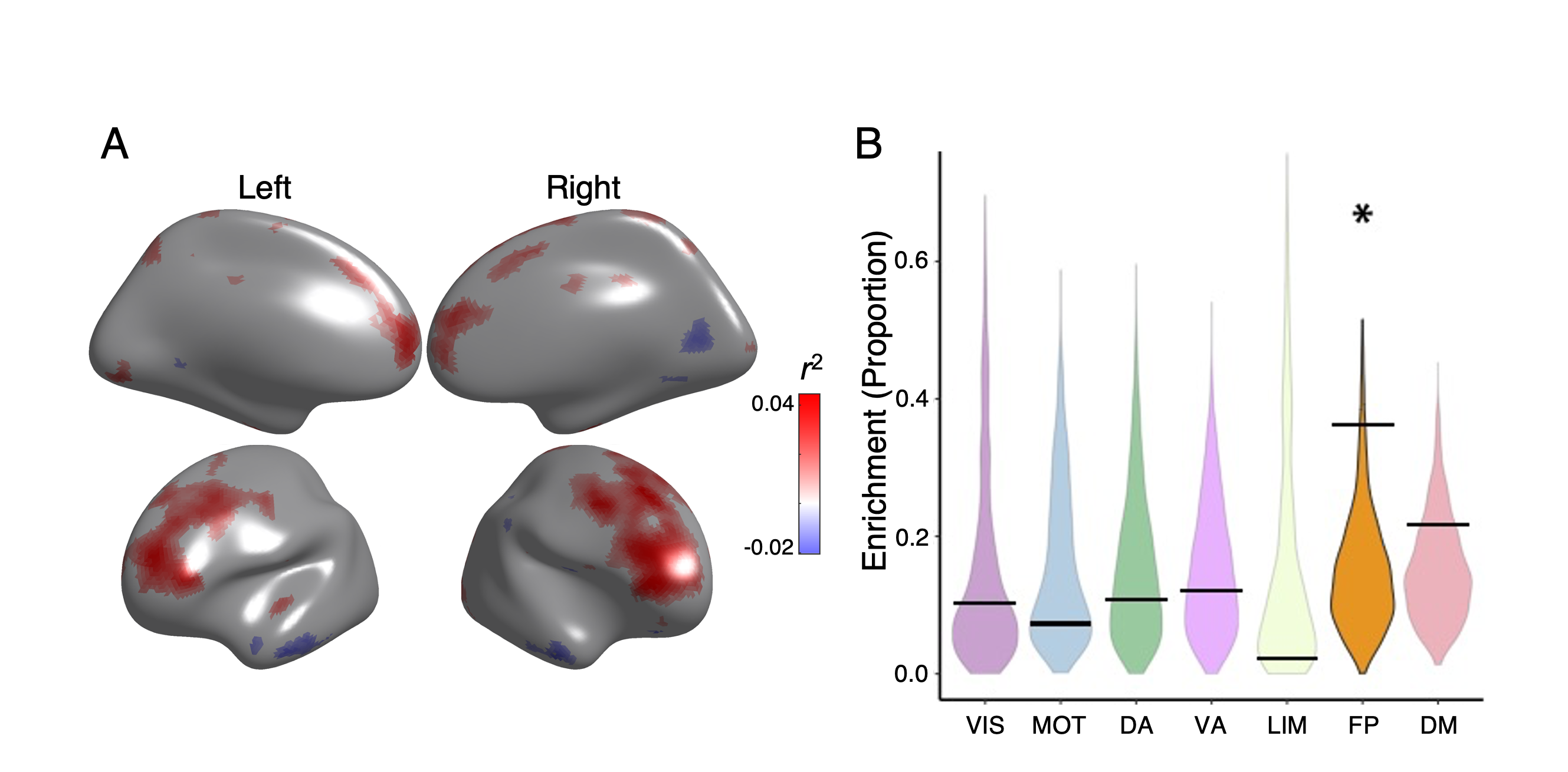
Figure 5 - Executive accuracy effects enriched in motor network and regions in default mode network